
Color calibration display: How to Calibrate Your Monitor for Accurate Colors: 4 Easy Methods
How to Calibrate Your Monitor for Accurate Colors: 4 Easy Methods
Digital creatives need a color-calibrated monitor, especially those that work with photos and videos. Calibration ensures the colors you see on your screen are accurate. If your display doesn’t show the correct colors, what looks natural to you might have different hues and temperatures when viewed on other devices or when you print it.
But how do you correct your monitor’s colors? Here’s how you can get authentic colors on your screen.
1. Use Your Computer’s Built-In Tools
Whether you’re using a Mac or PC, your computer has a built-in utility that allows you to adjust the displayed colors. Although this simple solution requires your vision and judgment, it’s free, doesn’t require installation, and is easy to do. You can use this if you don’t require a professional solution and only want to get the perfect color for your entertainment.
Also, before starting calibration with any tool, ensure that the lighting condition in your working area will stay more or less constant. This is because any changes in your ambient light may affect how you or the calibrating machine will see colors. That’s why you should calibrate your monitor based on your working environment.
Windows 10 and Windows 11
To open the Display Color Calibration tool on Windows 10, click the Start Menu, then type Calibrate Display Color in the search bar.
Click on the first result, and the Display Color Calibration tool will open. If you have multiple monitors, ensure the app is open on the monitor you want to calibrate.
Once you’re ready to calibrate, follow the onscreen instructions. This tool will help you adjust your selected monitor’s gamma, brightness, contrast, and color balance. When you’re done, your monitor should now display colors more accurately.
macOS Ventura
If you’re a Mac user, go to System Settings > Displays to calibrate your monitor. Under Displays, go to Color Profile. Select any profile that will fit your current display in the dropdown menu.
You can also choose Customize to create a color profile tailored to your current monitor. Clicking on that button will open a color profiles window. Near the bottom of the window, click on the + icon to launch the Display Calibrator Assistant.
Follow the steps to ensure you have a properly calibrated monitor. Once you’re done with that changes, macOS will let you save the color profile, allowing you to go back to the changes you made if you need to.
2. Use Online Monitor Calibration Tools
If you need better calibration, free calibration utilities are available online for your use. Although these do not change your computer’s color profile via software, they can help you adjust for accurate color, brightness, and contrast.
One such example is the Lagom LCD monitor test pages. This website lets you look at your screen’s contrast, resolution, sharpness, gamma, and more. When you click on a page, the website will show an image that will help you adjust your monitor. It also includes detailed instructions on what you should see and what you can do to get better results.
However, you must have a monitor with available manual setting adjustments to use this. You have to check what controls you have available with your monitor, but most external displays let you adjust brightness and contrast. More advanced and color-accurate monitors will allow you to change their gamma, color temperature, and RGB levels.
3. Download Color Calibration Software
If your monitor doesn’t have manual adjustments, and you find the built-in calibration app lacking, you can use color calibration software instead. One such app, called QuickGamma, allows you to change your screen’s gamma values with precision.
When you want to adjust your screen’s gamma in Windows, you only get a slider and a gray adjustment screen. But with QuickGamma, you can see gamma adjustments for each primary color. The gamma adjustment also comes with integer values, letting you set exact values.
The QuickGamma app has an in-depth help guide as well. This guide will help you make the proper gamma corrections to ensure you get the perfect brightness, contrast, and color on your screen.
Basically, your main goal is to get a neutral gray near the 2.2 gamma scale on the app. You shouldn’t see any dark lines across the columns at 2.2; the lines should blend into the background. You can use the plus and minus adjustment buttons to fine-tune your display and get the desired result.
Furthermore, the black columns on the right side of the scale are for adjusting your monitor’s brightness and contrast. The perfect setting should show Black Level Column A barely visible at the 2.2 gamma scale, while the Black Level Column B must be seen clearly.
While this tool is free and easy to use, its settings can be tedious to adjust. You must also rely on your vision and judgment to determine if you made the correct changes.
Download: QuickGamma for Windows (Free)
4. Get a Hardware Monitor Calibration Tool
If you require more precise correction, don’t trust yourself enough to get the proper readings, or don’t want to deal with the tedious adjustment process, you can opt for monitor calibration devices. The Datacolor SpyderX Pro is an example of one of those devices.
These tools have a spectrophotometer or colorimeter that detects your monitor’s output. It also comes with an app that will automatically adjust your display. Some advanced models also have an ambient light sensor to detect environmental light around the screen.
When you place the monitor calibration device on your screen, it uses a lens on the underside (monitor side) to focus a section of the display to a color sensor. The in-focus area will display a series of colors and images, allowing the sensor to capture it.
Once it has captured the data, it will compare it with a database of standard colors. The calibration tool will instruct the app to adjust the monitor’s colors and other settings as necessary.
This solution is perfect for professionals that require accurate color for their work. Photographers, videographers, graphic designers, and digital artists should calibrate their monitors monthly or as soon as possible if the lighting in their working area changes.
This is because a monitor’s color gradually changes over time, even though it’s not evident for most humans. Ambient lighting also affects how we perceive colors, so any changes to your environment require screen recalibration.
Everyone Can Benefit From Calibration
Whether you’re a professional artist or someone who just wants to have high-quality entertainment, you should calibrate your monitor. You do not need to use high-end calibrating devices that will set you back hundreds of dollars. All you need is a dark or neutral area and some patience to get your screen color just right.
If you’re asking yourself why you look like oranges on a beach when you view photos of yourself on your computer but look normal on your smartphone, it only means one thing: you need to calibrate your monitor.
How To Calibrate Your Monitor
Backlight Calibration
Minimum backlight
Maximum backlight
The easiest calibration setting is one that most people have probably already used. The ‘Backlight’ setting changes the amount of light your monitor outputs, effectively making it brighter. Changing the backlight level on your monitor doesn’t alter the accuracy of your screen significantly, so feel free to set it to whatever looks good to you. It’s sometimes called ‘Brightness’, which can be confusing. Generally, if there’s a single setting called brightness, it refers to the backlight. If there’s both a backlight and brightness setting, the backlight is the one you should be changing (as the brightness setting alters the gamma calibration, which we’ll look at later on).
Picture Mode Calibration
‘Standard’ mode
‘Movie’ mode
‘Dynamic’ mode
When it comes to color calibration, the best place to start adjusting the colors when calibrating your monitor is usually the picture mode. These are the setting presets the monitor comes packaged with and usually alter most of the image settings. It’s pretty important if you aren’t using a colorimeter for calibration because it’s otherwise very difficult to enhance your monitor’s color accuracy.
For the monitors that we test, we measure each of the picture modes and pick the most accurate one as part of our “Pre-Calibration” test. In general, though, the best mode is usually the ‘Standard’ or ‘Custom’ preset.
sRGB mode
Some monitors also come with an “sRGB” picture mode, often referred to as an ‘sRGB clamp’. It can be particularly beneficial in enhancing image accuracy on wide gamut monitors where the default color reproduction exceeds the sRGB color space, making some colors appear over-saturated. However, most monitors lock the rest of the calibration settings when this picture mode is enabled, which might bother some people.
Brightness And Contrast Calibration
The brightness and contrast settings change the way the screen displays tones at different brightness levels. These are easy options to adjust when calibrating your screen without a dedicated calibration tool, as most of the job can be done fairly accurately while simply displaying different gradient patterns.
Brightness
Minimum brightness
Correct brightness
Maximum brightness
The brightness setting affects the way the monitor handles darker colors. If it’s set too high, blacks will look gray, and the image will have less contrast. If it’s set too low, the blacks will get “crushed”. Crushing means that instead of showing distinct near-black steps of grays, the monitor will instead show them as pure black. It can give the image a very high contrast look at first glance, but it loses a significant amount of detail.
When calibrating your monitor, the best way to adjust the brightness is by using a near-black gradient test pattern like the one above. Raise or lower your brightness setting until the 17th step disappears completely, then go back one step to have it be visible again.
Some monitors have a ‘Black adjust’ or ‘Black boost’ setting that lets you adjust the black level. You can use it to make blacks look darker, but since you can’t make blacks look darker than what the display is capable of, it ends up crushing blacks. Some gamers use it to make blacks look lighter, making it easier to see objects in dark scenes, but it’s at the cost of image accuracy. It’s best to leave this setting at its default.
Most graphics card software applications have a dynamic range setting that lets you toggle between limited and full RGB range. A full RGB range means that the image is displayed using all 255 values, with 0 being absolute black and 255 being absolute white. It’s the default range for sRGB and the recommended setting for most modern LCD monitors. The limited range (16 – 235) is mainly used for TVs as most movies and TV shows are mastered in the limited range. In short, you have to match the source and the display as forcing your full-range monitor to display a limited RGB range makes the image look washed out, and forcing a limited-range display like a TV to show a full RGB range crushes blacks. The pattern we use is for calibrating a full-range display.
Download Pattern
Contrast
Minimum contrast
Correct contrast
Maximum contrast
The contrast setting is very similar to the brightness setting, but it affects the brighter parts of the image rather than the darker parts. Much like brightness, setting it too high will cause brighter images to “clip,” which is similar to crushing. Setting it too low will darken the image and reduce contrast.
Just like when calibrating for the brightness, adjust the contrast until steps up to 234 show some visible detail. The last few steps should be very faint, so it might take some trial and error.
Download Pattern
Sharpness Calibration
Correct sharpness
Maximum sharpness
Sharpness is one of the easiest settings to adjust, and generally, the default tends to be fairly accurate. Adjusting the sharpness changes the look of the edges of shapes that appear on-screen. Having it too low will give you a blurry image, while setting it too high will give the picture an odd look with strange-looking edges. It’ll also usually cause close, narrow lines to blend and produce a moiré effect.
The simplest way to calibrate this aspect if you aren’t pleased with the default is to set it at max, then lower it until no strange pattern forms between the lines and shapes of the test image.
Download Pattern
Color Temperature Calibration
Warm color temperature
Cool color temperature
The color temperature adjusts the temperature of the overall picture. A cooler temperature gives a blue tint, while a warmer temperature gives a yellow or orange tint. Think of it as the tone of the light outside at various times of the day. When the sun is shining bright at noon, the clouds and skies look almost pearl white without a distinct yellow. However, the light is yellow in the morning and evening as the sun rises and sets, and at night, white objects look blue when everything is lit by moonlight. We recommend a 6500k color temperature, which is the standard for most screen calibrations and is equivalent to midday light (also called Illuminant D65). It’s generally on the warmer side of most monitors’ scales. Some people find it too yellow, so feel free to adjust it to your preference.
White Balance Calibration
The white balance refers to the balance of colors across different shades of grey. An absolute white or grey has equal amounts of every color, with only the luminance distinguishing them.
Unfortunately, it isn’t possible to adjust these settings with any form of accuracy without the necessary equipment. In general, we recommend most people keep these settings at their defaults as they can easily make things worse. Even copying our settings made using a colorimeter isn’t recommended since these values will most likely be different across different units of the same monitor.
ICC Profiles Calibration
Calman’s ICC Profiler
If you do calibrate your monitor using a tool, your calibration software will likely create a calibration profile that ends in . icm. This is an ICC profile, effectively a reference table that your computer’s programs can use to display content accurately on your screen. In general, Apple’s macOS is better at handling ICC profiles, whereas Windows and Windows applications tend to be quite inconsistent with how and when they’re used. Generally speaking, hardware calibration yields better results, but since most monitors don’t allow for full calibration using the OSD settings, ICC profiles are essential to getting the best possible image accuracy.
Much like the white balance, we don’t recommend you use an ICC profile built on another monitor for your own, even if it’s an identical model. The variance in accuracy between units tends to be quite distinct, so the correction that these profiles apply might not necessarily match what your monitor needs.
Motion Settings
While usually less problematic than on TVs, there are a few settings that you can adjust to alter the quality of the motion produced by the screen.
Overdrive
Visible Overshoot
The overdrive setting adjusts the speed at which the monitor’s pixels switch from showing one thing to another. Usually, the default setting tends to be optimal, but you might prefer setting it higher or lower. A too strong overdrive setting will cause the pixels to overshoot, which creates a strange-looking inverted ghost following moving objects on-screen. A too low setting will create more motion blur, with longer trails following moving objects. You can learn more about overdrive in our motion blur article.
G-SYNC and FreeSync
G-SYNC and FreeSync are variable refresh rate technologies that allow the monitor to synchronize its refresh rate with the framerate of the input device automatically. It’s a great feature that reduces stuttering and generally makes for a more fluid experience. If your monitor supports it, we generally recommend keeping it on at all times unless you encounter bugs with certain games. G-SYNC specifically includes a “variable overdrive” feature that automatically adjusts the overdrive setting according to the game’s frame rate. You can learn more about these technologies in our G-SYNC vs FreeSync article.
Refresh Rate
The refresh rate of your monitor refers to the frequency at which it updates what is shown on-screen every second. The standard refresh rate found on most monitors is 60Hz, but some screens, usually gaming-oriented, support upwards of 360Hz. You should almost always set it to as high as possible. You can learn more about refresh rates and our related tests in our refresh rate article.
Additional Calibration Settings
Game Mode
Some monitors also feature a ‘Game Mode’ (sometimes called ‘low input lag mode’). We recommend using this feature, as it usually lowers the monitor’s input lag without altering the image quality, making it more responsive.
Low Blue Light
Similar to modern mobile devices like smartphones and tablets, many monitors have a blue light filter that can help reduce eye strain. It’s often called ‘Low Blue Light’ or ‘Reader Mode,’ and it essentially reduces the amount of blue light emitted by the screen, giving it an amber shade. It’s said to be less fatiguing on the eyes, especially at night. Most desktop operating systems have this feature built-in: ‘Night Mode’ on Windows, ‘Night Shift’ on macOS, and ‘Night Light’ on Chrome OS. There are also third-party apps that can do the same. We recommend leaving this off when calibrating your monitor.
Eco Mode
Many monitors come out of the box with a series of energy-saving features enabled. This generally alters the picture quality in undesirable ways and are better kept off. Usually, monitors will also have a dedicated “eco” picture mode that enables these features. If you would like to reduce the energy consumption of your monitor, we recommend reducing your backlight setting instead. Simply turning off your monitor every time you step away from your desk also greatly reduces idle consumption. It’s best to leave this setting off when calibrating the monitor.
Conclusion
Unless you have the equipment to perform a more thorough calibration, calibrating a monitor by eye is largely a trial and error process, so it may take a few tries before you get the results that you’re looking for. Fortunately, most monitors have a reset feature to discard any changes and bring the settings back to their defaults if you end up with worse image quality. While it’s generally recommended for content creators to calibrate their displays once a month because accuracy can drift over time due to panel degradation, most people can probably get by for much longer in between each calibration.
Monitor Calibration: How to Calibrate Monitor Colors Yourself
At the moment, products are not available for ordering on samsung.com/ru
At the moment, products are not available for ordering on samsung.com/ru
Select your location and language.
Explore
Stories
Photo
Lifehacks
Health
Entertainment
Food and Home
Interior with your character
Brand
Galaxy
collaborations
Stories
Photo
Lifehacks
Health
Entertainment
Food and Home
Interior with your character
Brand
Galaxy
collaborations
HACKS
With and without calibrator
03/31/2023 |
~3 min.
A calibrated monitor is an essential tool for photographers, designers and other professionals who need accurate color reproduction. Correctly setting up a monitor for working in the office is also useful: the more accurate the settings, the more comfortable it is to work behind the screen. We figure out why calibrate the monitor and how to do it yourself.
Why you need to calibrate your monitor
Calibration is the process of adjusting monitor settings to display colors and tones as accurately as possible. This is necessary, for example, when creating illustrations, photo processing, video editing and preparing layouts for printing. The more accurate the color reproduction of the screen, the more predictable the result of working with a wide variety of images.
A properly calibrated display also reduces eye fatigue with comfortable levels of brightness, contrast and color saturation.
Monitor calibration without calibrator
Calibrator is a monitor calibration device that measures and analyzes colors, brightness, contrast and other display parameters and then changes them to the optimal ones. For basic setup, a monitor calibration tool is not needed, although the result will not be perfectly accurate.
First things first: preparation:
- 1.ㅤMake sure the lighting in the room is about the same as usual. In this case, it is better not to use bright light sources.
- 2.ㅤTurn off the auto color setting.
- 3.ㅤIf the monitor is just turned on, allow it to warm up for 30 to 40 minutes to reach operating temperature.
- 4.ㅤClose photo, video and graphics applications.
Now for the calibration itself. You have to adjust the brightness and contrast, adjust the color gamut using the red, green and blue sliders, work with the color temperature and white point.
Let’s see how to do this on computers with Windows and MacOS operating systems. If you need to calibrate two monitors or more, set up each device individually.
Calibrating monitor colors in Windows
You can calibrate your monitor in Windows 10/11 and earlier using the built-in Color Management tool.
- 1.ㅤOpen the Windows Control Panel and select the Color Management tab.
- 2.ㅤGo to the “Details” tab and click “Calibrate screen”.
- 3.ㅤSelect the “Use my custom color management” option and click “Next”.
- 4.ㅤOn-screen prompts to help you adjust brightness, contrast and color saturation.
- 5.
 ㅤAt the end of the calibration, the system will prompt you to save the new color profile settings.
 ㅤAt the end of the calibration, the system will prompt you to save the new color profile settings.
 Another way: right-click on an empty area of the desktop, select “Display settings”, go to “Advanced display settings”, “Display video adapter properties”, “Color management”, “Detailed”, “Calibrate screen” .
Calibrate monitor colors in macOS
Let’s see how to adjust the display color settings using macOS Ventura 13.0 as an example:
- 1.ㅤOpen the Apple menu in the upper left corner of the screen and select System Preferences.
- 2.ㅤClick Displays.
- 3.ㅤ A drop-down list of color profiles will appear at the bottom right. Open it, click “Settings”, and then – the plus sign in the lower left corner. The calibration assistant opens.
- 4.ㅤFollow the instructions on the screen.
- 5.ㅤAt the end of the calibration, macOS will prompt you to save the new color profile settings.

Photo monitor calibration with calibrator
For professional color adjustment, a separate device is usually used – a calibrator. It allows you to measure the colors and brightness of the screen using spectrophotometric sensors. The application, which is installed on a computer and which works in tandem with the calibrator, compares the received data with color rendering standards and determines how accurately the monitor displays colors. If there are discrepancies, the application makes changes to the settings and offers to create a new color profile.
Monitor calibration by the calibrator is as follows:
- 1. ㅤConnect the device to the computer.
- 2.ㅤRun the software that comes with the calibrator.
- 3.ㅤFollow the instructions on the screen.
- 4.ㅤSet the color profile created by the application in the operating system settings.
 ㅤConnect the device to the computer.
 The main plus of the calibrator is that it can be used to adjust the color reproduction as accurately as possible. It is not necessary to delve into the nuances: calibration occurs automatically. And the new color profile can be saved and used on other screens.
Programs and online services for calibrating the monitor without a calibrator
You can also adjust the color of the monitor using third-party applications. For example, there is a free DisplayCAL for Windows, Mac, and Linux operating systems. A simpler (and also free) Calibrize for Windows. Or the professional X-Rite i1Profiler with an impressive selection of settings and options.
Online services such as Monteon and Lagom can help you manually calibrate your monitor’s color. But keep in mind that you won’t be able to calibrate the monitor online: such sites offer sets of test images to evaluate the color reproduction of the monitor, but you will have to change the settings yourself.
Monitor Calibration Test Photos
Monitor calibration pictures are needed to evaluate the accuracy of colors, contrast, brightness and other parameters. Here are examples of such pictures.
•ㅤStandard image for color evaluation. Allows you to check that the display displays colors correctly: clearly, without impurities and changes in hue.
•ㅤGradient image to check tone mapping. Everything is in order if the transitions from one color to another are smooth, without sharp transitions.
•ㅤImage to calibrate monitor contrast. The borders of squares of different shades of the same color must be clearly distinguishable.
•ㅤImage to judge the level of sharpness. Small details of the picture should not merge into a single whole, and the circle in the middle should stand out against the background of patterns.
Main
Properly calibrating your monitor will produce accurate colors and tones. This helps color professionals achieve predictable results and save time on gamma adjustments.
The Monitor Calibration Check is also useful for general users who want to make sure the screen displays colors correctly.
Fine-tune the display with a calibrator paired with a PC application. Manual color space correction can be done in the operating system settings or using third-party applications.
Clarity in every detail.
Ideal image for leisure and work
- HACKS
- Monitors
- Adviсe
See also
Photo monitor calibration
Understanding the principles of monitor calibration is critical for any photographer who wants to achieve accurate and predictable photo prints. If your monitor doesn’t reproduce shadows and colors correctly, then all the time spent editing and post-processing the image may actually be wasted. This chapter covers the basics of calibration for the average photographer, in addition to using calibration and profiling devices for highly accurate results. Further, it is assumed that throwing away the old monitor and buying a new one is not a solution.
| → | → | Calibrated monitor | ||
|---|---|---|---|---|
| Digital image file | Color profile |
Adjusting brightness and contrast
The simplest (but least accurate) way to calibrate your monitor is to adjust its brightness and contrast. This method does not require a color profile for your monitor and is therefore ideal for everyday use or when you need to make quick adjustments on someone else’s computer.
The images below are designed to help you select the optimal brightness and contrast setting. A well-calibrated monitor should be able to pass both tests, but if it fails, you’ll have to choose which of the two is more important. In any case, make sure the monitor is allowed to warm up for at least 10-15 minutes first.
1) Semitones . Well-calibrated midtones are often the highest priority task. The monitor should show the central square as being identical to the surrounding background in brightness, whether viewed with defocused vision or from a distance. The left and right squares should appear darker and brighter than solid gray, respectively.
© 2004-2011 Sean McHugh
Note: The above test assumes the monitor is set to 2.2 gamma.
If the center square is brighter or darker than the gray background, your monitor may be displaying images brighter or darker than expected. This will also have a noticeable effect on your print options, so this needs to be dealt with.
If you are using an LCD monitor, first set it to standard contrast (most likely either 100% or 50%) and then adjust the brightness until the center square blends in with the background. If you are using a CRT (the big “old-fashioned” type), set it to maximum contrast. In any case, make sure your monitor is set to 2.2 gamma if it has such a setting (this is the default setting for most modern monitors).
Note: Increasing the brightness of your monitor too much may shorten its lifespan. You probably won’t need maximum display brightness if the room isn’t too bright, if the monitor doesn’t have backlighting (such as a window in the background), or if it’s not too old.
2) Highlight and shadow details . If you performed the calibration in the previous step, the midtones on your monitor will now be displayed at approximately the desired level of brightness. However, it can also mean that shadows and lights are too bright or too dark, and vice versa. On each of the two following images, 8 steps should be distinguishable:
| Shadow details | Parts in the light |
The two extreme levels of shadows and light should be only slightly distinguishable. Otherwise, you’ve probably reached the limit of your brightness and contrast settings. Otherwise, if maximum shadow and highlight detail is more important than midtone luminosity, you can ignore the midtone test. In this case, first use brightness to achieve the desired details in the shadows, then use contrast to adjust the details in the light (in that order). If the brightness is too high, completely black will turn gray, but if there is not enough detail in the shadows, several of the 8 shadow levels given will appear the same.
However, the examples shown above provide only a coarse adjustment that covers only a small part of the tonal range and does not correct chroma at all. There are slightly more accurate methods of visual calibration, but ultimately obtaining truly accurate results requires systematic and objective measurements using calibration instruments.
Overview: Calibration and Profiling
The colors and shadows a monitor produces vary by monitor type, manufacturer, settings, and even age. Unfortunately, unlike in the digital world, the same numbers don’t produce the same results when it comes to monitors. As a result, green, for example, may turn out to be darker, lighter or of a different saturation than it was specified in numbers:
| Digital value green |
Monitor “X” |
Standard color |
||
|---|---|---|---|---|
| 200 | → | |||
| 150 | → | |||
| 100 | → | |||
| 50 | → | |||
| ← Color different → | ||||
note: in terms of this example, “standard color” is just
an example of a desired state that can be clearly defined in terms of
universal parameters such as gamma, white point, and brightness.
Ideally, your monitor would simply translate the numbers from the file into a standard set of colors. However, this is not always possible, so the monitor calibration process really consists of two steps: 1) calibration and 2) profiling.
1) Calibration is the process of bringing the monitor to a desired and well-defined condition. This usually involves changing various physical parameters of the monitor, such as the aforementioned brightness, as well as creating a so-called look-up table (LUT).
LUT takes an input value such as green=50 from the above example and then says “I know monitor X shows green=50 darker than standard, and if I convert 50 to 78 before sending it to monitor , the resulting color will be what green=50 should have been. In this way, the LUT translates the digital values from the file into new values that effectively compensate for the characteristics of the selected monitor:
| Digital value green |
LUT | Compensated digital values |
Monitor “X” |
Standard color |
||
|---|---|---|---|---|---|---|
| 200 | → | 200 | → | |||
| 150 | → | 122 | → | |||
| 100 | → | 113 | → | |||
| 50 | → | 78 | → | |||
| ← colors match → | ||||||
2) profiling is the process of characterizing the calibrated state of your monitor using a color profile. These characteristics include the range of colors that your monitor is capable of displaying (“color space”), in addition to the location of intermediate brightnesses within that range (“gamma”). Other properties can be included in the profile.
Profiling is important because different devices are not always able to reproduce the same range of chroma and shadows (“gamma difference”). A perfect conversion from the color of one device to the color of another is therefore not always possible. Color profiles allow programs that support color management to reach a reasonable compromise in the process of imperfect transformations:
| Original image |
Standard “A” |
Color management
→ |
Standard “B” |
Transformed image |
|---|---|---|---|---|
| ← Gamma difference → | ||||
| Wide range of colors | Narrow color range | |||
In the example above, Standard A has a wider green range than Standard B,
so that the colors of the original image are compressed from a wide range of
intensities to a narrow one. For details on the principles of color space conversion, see chapter
, Color Space Conversion.
Monitor Calibrator
Calibrator Application
Monitor Calibrator performs both calibration and profiling tasks. It usually looks like a computer mouse and is attached to the monitor screen. A special program then controls the monitor so that it shows under the calibrator a wide range of colors and shadows, which are measured and recorded in succession.
Common calibration devices include, but are not limited to, the X-Rite Eye-One Display, ColorVision Spyder, ColorEyes Display, and ColorMunki Photo.
Allow your monitor to warm up for at least 10-15 minutes before starting calibration. In this way, you will ensure the stability and reproducibility of brightness and color balance.
Immediately before starting the process, the program will ask you to set several parameters against which the calibration will be carried out (“target setting”). These settings can include white point, gamma, and brightness (we’ll look at those in the next section). During the calibration process, you will also be asked to change various screen settings, including brightness and contrast (and RGB values if you are using a CRT).
The result is a matrix of color values and their corresponding dimensions. Sophisticated software algorithms then try to create a LUT that will reproduce, first, neutral, accurate, and appropriately graduated grayscale, and second, an exact match of hue and color saturation across the entire gamut. If they can’t be perfectly rendered (and they never can), the program tries to prioritize them so that the inaccuracies are related to color and tint differences that our eyes can’t quite see.
Calibration settings
Here is a brief description and recommendation for each calibration target:
White point . This setting controls the relative warmth or coolness of the lightest tone on the screen, according to the “color temperature”. Higher color temperatures will produce cooler tones, while lower temperatures will appear warmer (yes, this is not intuitive at first glance).
| Warm color temperature | Color temperature of your monitor |
Cold color temperature |
Although the above samples seem slightly colder and warmer, this is
because they are located side by side. If you place any of them separately, so that they are
the brightest spot on the screen, the eye will adapt and you will call each of them “white”
You will find materials on this topic in the chapter on white balance.
For CRT monitors, the standard recommendation is a display color temperature of around 6500K (referred to as D65), which is slightly cooler than daylight. However, for LCD monitors, things are somewhat more complicated. Although many LCDs have a color temperature setting, their backlight always has its own color temperature. Any deviation from it leads to a narrowing of the gamma of your display. For this reason, LCD monitors are generally recommended to be left at their default color temperature unless you have a compelling reason to change it. Your eye adapts to the color temperature, and neither warmth nor coldness will be noticeable until they are compared directly.
Gamma . This setting controls the rate at which the brightness of the shadows fades from black to white (for each of the digital values). This makes the image look lighter for larger gamma values and darker for smaller gamma values, respectively, but the black and white points remain the same. Also gamma strongly affects the apparent contrast of the image:
| Gamma 1.0 | Gamma 1.8 | Gamma 2.2 | Gamma 4.0 |
Note: The above images assume that your screen is set to gamma 2.2.
Older Macs used a gamma value of 1.8 for a while,
but now they also use gamma 2.2.
Gamma 2.2 has become the standard for editing and viewing images, so this value is generally recommended. It also correlates best with how we perceive brightness variations and is closest to your display’s default setting.
Brightness . This setting controls the amount of light your screen emits.
Unlike white point and gamma, the optimal brightness setting is highly dependent on the brightness of your working environment. Most set the brightness to around 100-150 cd/m 2 , but bright work environments usually require higher values. The maximum achievable brightness will depend on the type and age of your monitor, and thus can drastically limit the allowable brightness of your work environment.
However, higher brightness settings will shorten the life of your monitor, so it’s always a good idea to dim your monitor a bit if you can afford it. Use the lowest possible brightness in the 100-150 cd/m range 2 where you can still see all 8 shadows in the sample above.
Calibration: Look-Up Table
The Look-Up Table (LUT) is either controlled by your graphics card or by the monitor itself, so it will be used whether or not your software is color-managed – as opposed to a color profile . The LUT is usually loaded immediately after the operating system boots and is used regardless of what is displayed on the monitor.
Whenever red, green, and blue numbers are equal, an accurate monitor should show this as neutral grey. However, you will be surprised at how often this is not the case (see below). The LUT*’s job is to keep the neutral gray tones in the correct gamut.
*Note: This example is for the simplest linear 8-bit LUT,
which is most commonly used with CRT monitors.
| R,G,B input | Monitor “X” |
Neutral gray |
||
|---|---|---|---|---|
| 200,200,200 | → | |||
| 159,159,159 | → | |||
| 100,100,100 | → | |||
| 50.50.50 | → | |||
| ← difference → | ||||
An example of a LUT that fixes the display on monitor “X” is shown below. It essentially applies independent tone curves for each of the monitor’s color channels:
| → | ||
| Uncorrected | Display table |
Note: The above table is linear and 8-bit; there are
more complex 3D LUTs that do not process each color independently.
However, the basic concept remains unchanged.
Without the above LUT, your video card sends the input color value 159 (from the digital file) directly to the monitor (no matter what color). Using the LUT, the video card substitutes the red, green, and blue values using tone curves. Input valueR,G,B=159,159,159 is sent to the monitor as 145,155,162 (which are now treated as neutral grey). Note also that a deeper color correction corresponds to a greater deviation of the tonal curve from a straight diagonal.
Often there are several LUTs in the display chain – not only in the video card. The other LUT that best matches your monitor’s calibration is its built-in LUT (as discussed below). If your monitor supports the ability to change the built-in LUT (some models allow this), this usually achieves a more accurate calibration than using the video card’s LUT. However, unless a calibration program has been developed specifically for your monitor, it will most likely use the video card’s LUT.
Profiling: Chroma Profile
A chroma profile defines calibration-based output parameters such as gamma, white point, and luminance, in addition to calibration measurements such as the maximum red, green, and blue intensities your display is capable of emitting. These properties together define the color space of your monitor. A copy of the LUT is also included in the profile, but it is not directly used because it is already implemented in the monitor or graphics card.
A color profile is used to transform images so that they can be displayed correctly, taking into account the unique characteristics of your monitor. Unlike LUT, you will need a program that supports color management to use a color profile when viewing images. This won’t be a problem if you’re running the latest operating systems on PCs or Macs, as they all support color management. Otherwise, use Photoshop or any other common image editing or RAW file conversion program.
Whenever a digital image is opened that contains an embedded color profile, your program can compare that profile with that of your monitor. If the monitor has a similar tonal range as indicated in the digital image, the values from the file will be directly converted by the LUT to values that are correct for your monitor. However, if the color spaces are different (as they usually are), your program will perform a more complex conversion. This process is called color space transformation.
Monitor Calibration Test
Don’t assume that just because you’ve done a color calibration, your monitor will begin to accurately reproduce color without any difficulty. It is also important to check the quality of this calibration. If you find that your calibration device was unable to correct some inaccuracies, you can at least take this into account when processing images with methods that affect color.
The easiest and fastest way to evaluate the quality of a color calibration is to look at a large black and white gradient in a program that supports color management. A sub-optimal monitor calibration can render this gradient with slight vertical color banding or sudden discrete jumps in tone. Hover over the following sample to see what a low quality monitor calibration might look like :
An example of a smooth neutral gradient to diagnose monitor calibration quality.
This gradient is best suited for diagnostics when viewed in full screen and when the color profile is turned on and off. Photoshop allows this to be achieved by setting “Proof Colors” to “Monitor RGB”; CTRL+Y toggles the monitor profile on and off. If “Monitor RGB” is enabled, it means that the monitor’s color profile is not is used.
If banding is visible in the gradient, your monitor may need to be recalibrated. It’s usually recommended to do it monthly or so, depending on how important color accuracy is to your work.
Otherwise, the color reproduction of your monitor may be so far from optimal that the color profile will set an extreme correction. This may be due to the monitor calibration you are using, or it may be due to its age. In the latter case, the color profile will still be a big plus compared to its absence – but the color reproduction will not become sinless.
Monitor calibration limits
Unfortunately, there are limits to calibration accuracy. For a digital monitor, , the more you need to change the monitor’s settings from the default settings, the more you lose out on the amount of color tones and shadows it can display . Fortunately, the bit depth of your monitor’s built-in LUT can affect how well it is calibrated, as a monitor with a larger LUT can use a wider color gamut:0003
| → | or | |||
| Uncorrected | Small LUT | Multibit LUT | ||
|
(4 output shades) |
(2 output shades) |
(4 output shades) |
Note: The increased bit depth of the built-in LUT does not mean that the monitor can show more shades of color is simultaneously , since the number of input values remains the same. That’s why increasing the bit depth of the video card’s LUT by itself will not allow you to achieve a more accurate calibration.
In the low-bit example, the brightest (4) and darkest (1) hues are forced to white (5) and black (0), respectively, as the LUT rounds to the nearest available output value. On the other hand, a multi-bit LUT may use additional intermediate values. This greatly reduces the likelihood of color banding and image posterization – even if the monitor is old enough and deviated significantly from the original color.
If you have a new precision monitor with an 8-bit LUT, you will probably get a good calibration; the role of the bit depth of the LUT begins to grow as the monitor ages. Most displays use an 8-bit LUT, although some have 6-bit LUTs and others 10-bit or more. Avoid using LCD monitors designed for gaming, as they often sacrifice the bit depth of their LUTs (or other aspects) for a fast refresh rate, which is of no importance when viewing still images.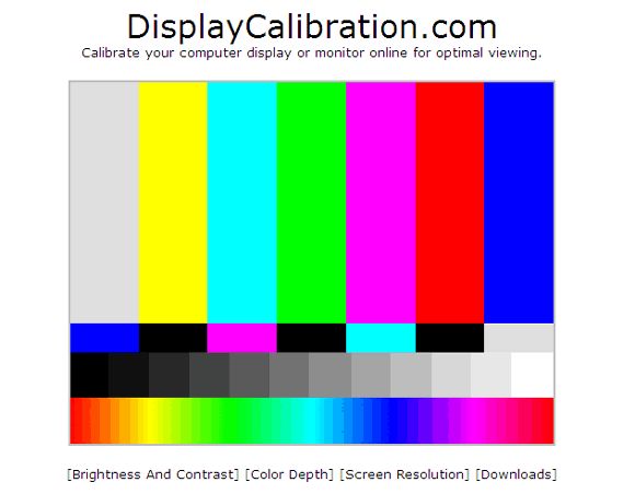

 While a 32-inch TV may be too small for you and a 55-inch TV may be too big, a 43-inch TV hits the sweet spot. Thankfully, these 43 inches now are replete with all the modern features that you could ever think of.
 With game mode, AI voice-enabled remote, multitasking features and more, you get the best value from your TV in this budget. The quad-core processor ensures quick actions and allows you to execute your commands quickly.
 Using its voice assistants, you can quickly access content, get answers and even control your TV with the help of in-built voice assistants – Bixby and Alexa. Crafted with an effortless minimalistic style from every angle, this television has a boundless design that sets new standards.
 On the TV, you can use Alexa to set reminders and timers while watching TV. Experience high performance gaming in ultra fast sequences with the responsive and powerful multi core processor supported by a fantastic 60 hz screen refresh rate.
 Furthermore, the TV comes with 20W strong stereo speakers with Dolby Audio compatibility to provide you with a really immersive audio experience. This TV is extremely user-friendly, allowing you to navigate through more than 30 content partner applications and more than 75 free live channels.
 Now, enjoy the visuals on this 43 Inch 4K Ultra HD Smart TV that comes with 3840 x 2160 pixels resolution. Combined with the Frame Dimming technology, this Smart TV creates realistic pictures full of lifelike contrast. The HDR10, HLG, Dolby Vision technology along with 4K HDR Processor X1 enhances the viewing experience.
 So, to choose a quality device, you should be guided by several criteria.
  Devices generally support voice search and gesture control. Tizen has a minimalistic interface, just like LG’s Web OS.
  LED backlighting allows you to save space and produce thin devices. At the same time, the price of such devices is lower than that of QLED or OLED. LED devices, in turn, differ in the arrangement of crystals in the matrix on IPS and VA:
 A panel with this backlight option is better to choose if you plan to watch movies or TV shows in the evenings.
  In addition, the OLED TV is only a few millimeters thick. The downside of OLED is only one – the high price.
  The higher the screen resolution, the better the picture quality. Currently, there are four types of devices:
 There are several HDR formats, which one is supported by your Smart TV model, you can check the specifications from the manufacturer. To make sure that the selected model has the HDR function, you need to look for the ULTRA HD Premium or 4K HDR logo on the box.
  Consider a few nuances that will help you make a choice in favor of a Smart TV:
 )
) It has become widely popular due to its compatibility with many platforms and operating systems, its low cost of implementation, and its ease of use. Most computers that are built today come with several USB ports, and USB is the interface of choice for most home and office peripherals including printers, cameras, modems, and portable storage devices.
  It has been tested with up to 10,000 connection cycles and is 6 times more durable than USB-A. A USB-C cable is capable of carrying USB 4, Thunderbolt 4, Thunderbolt 3, USB 3.2, USB 3.1, USB 3.0, USB 2.0, and USB 1.1 signals. USB-C 3.2 can carry up to 100W, which is enough power to support traditional mobile device charging. Native support of DisplayPort video and four channel audio will allow a USB-C device to connect to a computer monitor, HDTV, surround sound system and headphones. Transfer rates up to 40Gbits/s make USB 4 and Thunderbolt 4 ideal solutions for transferring large amounts of data, such as HD video for editing, Blu-ray™ authoring, or high resolution photos for editing or storage.
 99
99
 0 ports. USB 3.0 A connectors are often blue in color to help identify them from previous versions.
 0 device 5 additional meters
 0 B Products
 This interface holds the connection in place by friction which makes it very easy for users to connect and disconnect. Instead of round pins, the connector uses flat contacts which can withstand continuous attachment and removal very well. The A-socket connector provides a “downstream” connection that is intended for use solely on host controllers and hubs. It was not intended for use as an “upstream” connector on a peripheral device. This is critical because a host controller or hub is designed to provide 5V DC power on one of the USB pins. Though not that common, A-A cables are used to connect USB devices with an A-style Female port to a PC or another USB device, and for data transfer between two computer systems.

 99
99 6ft (2m) USB 2.0 A Male to A Male Cable – Black
 0 A/B Cable – White
 3ft (12m) USB A/B Active Cable (Center Booster Format) (39.4ft)
 99
99 Micro-USB B offers a connection physically smaller in size to a USB Mini-B, while still supporting the high-speed transfer rate of 480 Mbps. The connection can be easily identified by its black-colored receptacle and compact 5 pin design.

 Works for many camera models from the major brands.
 0 devices and 1 Mini-b device to your PC with just one cable.
 Works for many camera models from the major brands.
 0 devices and 1 Mini-b device to your PC with just one cable.
 0 or USB 1.1 devices.
 This connector type only exists as a receptacle for On-The-Go devices and will not exist on a cable.
 99
99 99
99 Vadima Sivkova, 150, shopping center Europe:
 S2-006a:
 Composer Kasyanov, d. 6 G, module 4, department E1:
 , 21/24:
 Belyaeva, d. 6:
 Svobody, d.13:
 We will answer the question of what is the difference between USB 3.1 Gen 1 and Gen 2, and talk about why Gen 2 is better than Gen 1, as well as other useful information that will allow you to understand everything you need to know about the standards USB.
  1 Gen 1 and USB 3.1 Gen 2 is purely speed. USB 3.1 Gen 1 supports speeds up to 5 Gb/s, while USB 3.1 Gen 2 supports speeds up to 10 Gb/s. USB-IF intended to use different names to refer to USB 3.1 Gen 1 and USB 3.1 Gen 2, which would be better for marketing purposes. USB 3.1 Gen 1 and Gen 2 were supposed to be called “SuperSpeed USB” and “SuperSpeed USB+”, respectively, but these names never caught on in the industry. Often, to distinguish between these two USB standards, OEMs add 5 Gb/s or 10 Gb/s speeds to their specification sheets. Others simply call them “USB 3.1 Gen 1” or “USB 3.1 Gen 2”.
  2
2  Thunderbolt 1 and 2 use the same connector as Mini DisplayPort (MDP), while Thunderbolt 3 uses USB-C.
 You must make larger payments to avoid the interest. Advertised monthly payment, if any, is greater than your required minimum monthly payment and may exclude taxes, delivery or other charges. Limited Time Offer. Regular account terms apply to non-promo purchases. Standard Purchase APR: 29.99%. Minimum interest charge: $1. Prior purchases excluded. Account must be in good standing. Subject to credit approval. Samsung Financing account issued by TD Bank, N.A.Show Less
:max_bytes(150000):strip_icc()/black-cabinets-stainless-steel-appliances-e1d0a0e2-be849f8f0ee844f590e71e1005332a6d.jpg)

 Show Less
 Approximate Dimensions (Inches) Height: 36 1/4 Width: 29 7/8 Depth: 29 1/2 Model Number: PGS930BPTS CATCH PGS930BPTS GE Profile 30″ Smart Slide-In Front Control Gas Range with No Preheat Air Fry – Black Stainless Steel
 Approximate Dimensions (Inches) Height: 36 Width: 29 7/8 Depth: 28 5/8 Consult product installation guide for exact dimensions. Model Number: weg750h0hv WEG750H0HV Whirlpool 30″ Smart Slide-In Gas Range…
 00
00 00
00 10$1649.00
 00$1799.00
 10
10 8 cu.ft. Wifi Enabled Gas Range with Convection and AirFry – Black Stainless Steel
 Design Touch Control for Easier…
 10
10 00$5976.00
 It will look like this… These chimneys do not come in a sandwich version, so passing them through the ceiling will be less fireproof. They are covered with heat-resistant light paint. When using these chimneys, there are limitations – their standard diameter is 110 mm.

 It is also used in the dairy/chemical/textile/paper/pharmaceutical/petroleum industry, mechanical engineering and the production of consumer goods. Recommended working


 Some local repair shops may offer lower prices than iFixScreens. Still, it’s crucial to choose a reputable shop with experience with these types of repairs that can provide high-quality work.
 You can easily visit the store and ask for a free replacement. Reputed stores like iFixScreens offer a 180-day hassle-free warranty on any parts installed on your iPad.
 A 180-day warranty backs every repair service. All parts are new and have OEM standards, so there’s no need to worry about quality. Another option is to replace the glass using a repair kit that costs anywhere from $20 to $50. Remember that if your iPad is under warranty or covered by AppleCare+, the repair or replacement may be covered at no cost.
 9-inch): $269-$329
 Some local repair shops may offer lower prices than iFixScreens. Still, it’s crucial to choose a reputable shop with experience with these types of repairs that can provide high-quality work.
 You can easily visit the store and ask for a free replacement. Reputed stores like iFixScreens offer a 180-day hassle-free warranty on any parts installed on your iPad.
 A 180-day warranty backs every repair service. All parts are new and have OEM standards, so there’s no need to worry about quality. Another option is to replace the glass using a repair kit that costs anywhere from $20 to $50. Remember that if your iPad is under warranty or covered by AppleCare+, the repair or replacement may be covered at no cost.
 Thank you so much!!!! I will recommend to my friends and relatives. THANK YOU!!!!
  I bought a module on Ali, but I didn’t manage it myself, due to the lack of experience and a normal tool (a set of tools from Ali came disgusting). The master delivered in 5 minutes (+/-). Everything is clear and fast. Well, the price is more than reasonable.
  Attention to the client and the work done on 5+ struck. I recommend and will be back!
  They repaired it very quickly at a cheap price, and most importantly, qualitatively. I advise everyone!
  I want to thank you for the quality work! I am very pleased!
  All work was done at the highest level. I really liked the staff and the speed of work. Kind, polite, you will not always find such an attitude towards customers. I will only use this service here.
  I will contact this company more than once because I really like it as a client
  Focused on price. I did not have time to get home, after putting the phone in for repair, as I received a message about the successful completion of the repair. The cause of the malfunction and the cost of the repair were fully consistent with those declared at the time of delivery for repair. I am not a young enthusiastic girl, moreover, I myself am a serviceman in another area, I can objectively assess the quality of services. I am delighted. Separate respect and respect to Igor. The man knows his business.
  It also seems to me that the manager liked me and he made me some kind of display protection as a gift – it is practically invisible, but after that, my daughter dropped the phone, I picked it up with bated breath and the display turned out to be alive. \
 He assessed the damage and took all measures to eliminate the cause of the failure. The owner is polite and apparently knowledgeable. The time of his work took no more than 20 minutes.
 We did not expect that everything would be done so quickly and they would not even take the money.
  The screen was buggy in my mobile, and in such a way that some operations were performed on their own and could not be controlled. There were even cases when, having entered the Sberbank Online application, a transfer could be automatically made. Typing any text in SMS became impossible: it turned out some kind of ABRACADABRA … In short, the phone began to create problems for me in everything. And I had to turn to specialists. I found the address on the internet. From a detailed conversation with the master, I immediately realized that nothing would be imposed on me here, so I trusted him. I was offered several options for solving the problem with a detailed description of the costs (the prices were the same as on the website). I chose to replace the screen… And I didn’t regret it! The very next day when everything was done. my problems disappeared as if they never existed… RESPECT and RESPECT!!! I recommend!
  … everything happens for the first time. And the first positive experience in this business is very important. The first time I came with the fact that the phone was not charging from charging. In 2 minutes!!! the master cleaned the connector on the phone and did not charge a penny for it. shock. On the radio market, they would probably say that you got a guy – there is a lot of work with the replacement of a half-phone. Therefore, the choice of the center for the second time (drowned an iPhone in the pool) was obvious, although driving from Odintsovo to the center of Moscow is still a pleasure. And everything is great again. And it’s not just the cost of an old iPhone, but the fact that I really don’t like the process of transferring data to a new one. In general, quickly, efficiently and for a reasonable price. And many thanks to Lydia Konovalova for constantly keeping me informed about the stages of the repair. It’s so nice when such nice people help you solve your temporary life troubles.
 The repair itself took less than the promised time. On the website and in the salon it is written that as a gift a free protective glass, unfortunately, the glass was not delivered to me, because it was not available, but they made cleaning the phone a bonus. Most of all, I was surprised by the papers that I signed, in the previous salon, in which I had already repaired another phone, there were no guarantees and contracts, I really liked the responsibility of the salon!
 Recommend to everyone
  The son broke the phone. Today I handed it over for repair today and repaired it. Got checked. Happy as an elephant. Fast, high quality and inexpensive (I know what I’m talking about because there is something to compare with). Thanks a lot!
  Everything is fast and available. Very friendly or helpful master
 The master did everything quickly and efficiently. The prices are acceptable. In general, everything is super, I advise ☺️
  I will contact this company more than once because I really like it as a client
  I will recommend your service to family and friends. Low prices deserve special attention.
  a large axial load, but the master first of all cleaned the nest, blew it and checked it, everything was fine! 5 min and done)
  I advise everyone!
  I am not a young enthusiastic girl, moreover, I myself am a serviceman in another area, I can objectively assess the quality of services. I am delighted. Separate respect and respect to Igor. The man knows his business.
  \
\  I liked the guarantee: I have 3 months. So I recommend it. The price, by the way, is sane.
 They made a big discount))) in general, I recommend the service, we can’t find better specialists in the city!!!
  I will definitely use again and recommend to everyone. The prices justify themselves and the efforts of the staff. Everything is quite popular and accessible.
  And I had to turn to specialists. I found the address on the internet. From a detailed conversation with the master, I immediately realized that nothing would be imposed on me here, so I trusted him. I was offered several options for solving the problem with a detailed description of the costs (the prices were the same as on the website). I chose to replace the screen… And I didn’t regret it! The very next day when everything was done. my problems disappeared as if they never existed… RESPECT and RESPECT!!! I recommend!
  Therefore, the choice of the center for the second time (drowned an iPhone in the pool) was obvious, although driving from Odintsovo to the center of Moscow is still a pleasure. And everything is great again. And it’s not just the cost of an old iPhone, but the fact that I really don’t like the process of transferring data to a new one. In general, quickly, efficiently and for a reasonable price. And many thanks to Lydia Konovalova for constantly keeping me informed about the stages of the repair. It’s so nice when such nice people help you solve your temporary life troubles.
 The repair itself took less than the promised time. On the website and in the salon it is written that as a gift a free protective glass, unfortunately, the glass was not delivered to me, because it was not available, but they made cleaning the phone a bonus. Most of all, I was surprised by the papers that I signed, in the previous salon, in which I had already repaired another phone, there were no guarantees and contracts, I really liked the responsibility of the salon!
 99
99 99
99
 99
99
 99
99
 99
99 99
99 99
99 99
99 99
99
 99
99


 11 a/b/g/n/ac
 We also researched them with the best streaming services. During our research, we specifically looked for features like resolution, picture quality and smart TV capabilities. To test these features, we watched our favorite movies and played our favorite games and compared the results to one another.
 The Toshiba 32LF221U19 offers 1080p resolution and impressive voice control options using Amazon Alexa.
 Unfortunately, these ads can’t be skipped or hidden.
 The 32 inch LED TV offers the most impressive color accuracy out of all the TVs on our list, but suffered a bit when it came to black levels. Make no mistake, this is a no frills LED television that focuses solely on providing a good picture, which it does well, especially considering the price. Unfortunately, you’ll only get 720p resolution so don’t expect the most high-definition experience. Although, with a HDMI cable you can get sharp pictures with higher quality video and audio, but the cable is not included. HDMI ports can also be used to give your TV smart features by connecting devices such as an Amazon Fire TV stick for over 500,000 programs, or Google Chrome Cast to enjoy YouTube and Google Play videos. If you want a TV with higher image quality, you might want to look at a more expensive model.
 Also, with an internet connection, you can use the Samsung ConnectShare Movie feature to access media from a USB storage device, or play movies directly from a USB enabled camera or external hard drive. If you’re looking for a really simple, easy-to-use LED TV at an extra-affordable price, the Samsung is the choice for you. If you live life outside, the best outdoor TVs are a good choice too.
 If you’re looking for an affordable smart TV experience in a TV that’s also great for gaming, then you can’t miss the TCL 32S325. Smart features are delivered through the Roku TV interface which is the easiest to use on our list and it’s constantly upgraded to keep it working well at all times. This model is also compatible with Alexa and Google Assistant. Much like the best 4K TVs.
 You’ll get accurate colors and a decent contrast ratio with this LED TV. This is the best budget 32″ LED TV on our list with the best picture quality and performance for its price range. If you want something twice the size, look at the best 65 inch 4K TVs.
 If you’re on a budget that you absolutely cannot break, this is the TV for you. While it doesn’t offer any kind of smart TV functionality, it still performs well overall.
 However, because these are premium models running on the Android TV UI with all the smart features imaginable, they are over the $10,000 range.
 To discover the best TV for your home, take a look at this list to compare.
 Perhaps that shouldn’t be a surprise, as Roku has been around for quite a bit longer than other options, originally appearing as the navigation interface in some of the first stand alone DVRs.
 When you can pick up a television that still measures 32 inches diagonally for just a few hundred dollars, you’re receiving a nice deal.
 These make it easy to find the best streaming movies.
 You’ll want the difference between the whites and blacks to be as distinct as possible. TV manufacturers measure contrast in a ratio, where any measurement of 3,000:1 or higher is a good performance level.
 LED TV review articles on our site can help you find a great model too.
 If yes, then your choice is budget models with Smart-TV support. It is on this principle that we structured the leaders of this segment.
 The Hoffson A32HD500T2 comes with a basic digital tuner that supports two broadcast options, including DVB-T2 (broadcast) and DVB-C (cable TV). As in the previous model, resolution (1366 by 768 pixels) at a frame rate of 60 Hz. For this size, the picture is quite detailed and attracts with an optimal level of smoothness when watching both cartoons or TV shows and dynamic content (thrillers, sports programs). It is possible to record content if you go to review some interesting program, but it does not have the opportunity in a given period of time. The peak brightness level reaches 180 cd / m², which is a good indicator for this form factor.
  This is a fairly functional product with support for recording TV programs, which boasts good brightness and actual static contrast. Unlike many brands that indicate the dynamic range – it indicates the correct and rational value: 3000 per 1. The volume is 12 watts, which is measurable with many larger models. It is worth adding that the manufacturers of a well-known company paid due attention to the design by adding USB, VGA. The declared rate of CID is 300 fps.
  I am glad that this model is equipped with a stand, which will be appreciated by buyers who do not have the opportunity to install the TV on the wall. The peak brightness of 200 cd / m² is almost 30% higher than that of analogues, although such a picture costs more. Claimed static contrast ratio is 3000:1, and good sound is due to support for Dolby Digital Plus technology. The power is 10 watts.
  Direct LED technology is responsible for backlighting. The advantages include an impressive warranty and excellent sound with a power of 16 watts.
  This form factor brightness is clearly enough. The static contrast ratio is modest, but it compensates for the functionality and good sound with a total power of 16 watts. It should be noted support for two USB ports, support for DLNA and RAM in the amount of 1 gigabyte. That’s enough for speed. The digital tuner covers all types of broadcasting.
  We note an excellent digital tuner and a really chic sound with support for the Dolby Digital Plus audio encoder.
  4 ports;
 a. 0289

 However, unlike them, it can be placed in virtually any space (with the exception of perhaps the bathroom). The junior model of the S1 series from Haier is an example of basic equipment that has quite advanced technologies and is perfect for small rooms.
 You can connect the TV to a video player, as well as to a game console or computer as a monitor.
  5 ms
5 ms  The basic add-on, which is in all TVs from Haier, is dynamic range expansion, or HDR 10 . If you do not go into technical nuances, it converts the glow of pixels and allows them to display several million shades more than in the standard TV range (SDR). Peak brightness, contrast and color reproduction will be higher when HDR10 is activated, the content will look realistic.
  As a result, the sound seems to be more spacious.
  Also, the power button and a stripped-down control panel (in the form of a five-way joystick) are present under the screen.
  In Russia in 2022, there were more than 40 million of them, and their share in annual sales is about 70%, retailers say. 32 Smart TV S1 (like all Haier models) also belongs to the category of smart and runs the current version of the Android TV 11 operating system from Google.

 00 122067 P981882″>
 00 104149 PA07832″>
 00 123574 PA69149″>
 00 64199 P527885″>
 00 115279 P566333″>
 00 127150 P114100″>
 Pricing are subject to change without notice. Any advertised down, monthly, bi-weekly, and weekly payments are estimated examples and / or approximate payments only and subject to credit check and approvals.
 Refurbs are almost always sold at a significant discount (and more often than not, they work just as well as brand-new gear), but the idea of dropping a lot of cash on previously owned items can feel a bit unsettling.
 Just keep in mind that many manufacturers have storefronts on third-party selling sites such as eBay, Newegg, and Amazon, so you don’t always have to make the purchase from the manufacturer’s website to secure a trustworthy refurb. Our one exception is that every so often we find a good deal on a relatively inexpensive item from a reliable seller on a non-manufacturer refurb. We’ve had the most luck with Best Buy’s Geek Squad, and we cap the price of the item at around $100. It must, however, meet our other criteria as well. (See below for more details.)
 4% of it was collected and recycled. “Buying refurbished keeps e-waste from landfills,” says Serge Verdoux, the managing director of Back Market, an online marketplace dedicated to refurbishing devices. “Beyond that, our hope is that, eventually, the growth of the refurbished market will help slow the pace of manufacturing and buying new devices so that recycling efforts can finally catch up to the amount of e-waste produced.”
 From there, each item is cleaned, tested, and inspected. Minor defects are repaired, and necessary parts are replaced—including batteries that fail Dyson’s testing. Once the item is reassembled, it goes through final testing and inspection. Dyson itself sells its refurbs through the Dyson Outlet, as well as through its eBay storefront and at retailers like Walmart; all refurbished products come with either a six-month or a one-year warranty, depending on the item.
 Refurbished robot vacuums sold by Eufy are covered by a 90-day warranty and a 30-day return policy—but, generally speaking, Wirecutter senior staff writer Liam McCabe points out that because Eufy bots aren’t durable, you might regret the somewhat shorter warranty period. “A not-small number of reviewers of their vacs cite that they had to use the warranty right around the 12-month mark,” Liam says. We still recommend purchasing Eufy refurbs if you’re looking to save some cash, as long as they come from retailers with good return policies and customer service. So those refurbished deals are the only ones we post.
 Each appliance is thoroughly inspected, repaired, and tested by hand, and minor surface scratches and blemishes are repaired or minimized. All certified refurbished items come with a six-month limited warranty and a free 30-day return if the item arrives defective.
 “I’d trust Baratza’s refurbs,” Marguerite says. “As a company, they’re committed to repairability—those grinders are easy to repair yourself or can be sent in for repairs, and the refurbs come with a one-year warranty.”
 All HP refurbs are covered by a one-year limited warranty and a 10-day return policy.
 Jabra’s certified refurbished products are inspected, cleaned, and repaired to meet the company’s specifications. Though fully functional, Jabra refurbs may come with minor cosmetic imperfections. These refurbs, sold either through Jabra’s direct website or on third-party platforms like Newegg, are also backed by a 180-day warranty.

 You can search the internet or contact your bank to help you identify an organization that can help you check if the equipment has liens on them or not. The simple solution is to shop from someone you know and trust whenever possible to avoid getting stolen goods.
  Black means the engine is burning too much fuel. White indicates that the fuel is not burning correctly, and blue indicates that the engine is burning oil, which can be caused by a worn seal or ring, or engine overflow.
 Leo Pracher is available as a direct contact person.
  We select used injection molding machines before purchasing, and then carefully prepare and test them. So you avoid not only high investment costs, but also possible unpleasant surprises from used equipment.
  We select used injection molding machines before purchasing, and then carefully prepare and test them. So you avoid not only high investment costs, but also possible unpleasant surprises from used equipment.
 3/5. That makes an aggregate score of 91%.
 36 lb (8.78 kg)
 Be prepared for better color gradation and precision in more shades on this VESA DisplayHDR 400 monitor
 8” Full HD Review
 709 and 95% DCI-P3 (which covers approximately 25% more color space than sRGB) for the truest color reproduction.
 Also, speed up the time it takes to transition from your desk with a single cable that transmits power, data and video—all at once.
 Products displayed as Sold Out, In Store Only, or Check Stores cannot be ordered by phone. Call Center agents are not able to provide guidance on inventory levels.
 For vehicle installations, you can view, schedule, check, change or reschedule appointments by visiting Geek Squad® Autotech Reservations. Please keep in mind that demand for appointments around the holidays is so high that appointment slots typically fill up quickly.
 Together, we can transform your living space with the latest smart home technology, HDTVs, computers and gaming consoles from your favorite brands. We can walk you through updating your appliances with cutting-edge refrigerators, ovens, washers and dryers. And we can help you make the most of your active lifestyle with our huge selection of health and wellness gear.
  You can also shop popular categories online or Discover & Learn with our detailed Shopping Guides, in-depth How-To guides and helpful Tips and Ideas. Learn how to live more sustainably, discover the latest must-have electronics and explore what best fits your lifestyle, home, workspace and everything in between.
 99.
99. com will have the latest product availability information. Check back frequently, as product availability may change. Statuses such as Sold Out or Check Stores may update throughout the season. Products displayed as Sold Out, In Store Only, or Check Stores cannot be ordered by phone. Call Center agents are not able to provide guidance on inventory levels.
 org/Question”>
 BestBuy.com is open 24 hours a day, 7 days a week, 365 days a year and offers free around-the-clock chat support.
 Or check out our Geek Squad Intelligence blog for expert articles, helpful forums, frequently asked questions and more.
 Saint Emma Monastery
  Registration on the site www.studyusa.ru
 Philadelphia, the second largest city on the East Coast, is modern yet…